 |
| Assignment 2: The objective of this assignment was to make 9 textures. The first row was for just textures, the second emphasizing space, and the third emphasizing value. We had to use the pen tool on Illustrator for this assignment, and I learned a lot about tracing and using the pen tool. I thought that this project was fun. |
 |
| Assignment 3: For this assignment, we were told to make a color wheel using two different shapes that went together. I chose an elephant and a peanut. I learned a lot about how to create color. We used the pen tool and color. |
 |
| Assignment 4: For this assignment, we took pictures of ourselveso n photobooth and colored them in to make popart. This was my first time using photoshop, and I know its not my best work:) |
 | |
|
 |
| Assignment 6: For this assignment, we were supposed to create a place that we would go if we could "cross the road." I chose the North Pole. In photoshop, I used layer masks to create the shapes I wanted. This was my favorite assignment so far. |
 |
| Assignment 7: This is the blended face assignment. We were supposed to put ourselves with a group so that we look like we were there. I chose Modern Family, and I used layer masks to "blend myself in." |
 |
| Assignment 8: In this assignment, we turned a pictuere into a typographic design. I chose the word christmas and typed it aroung the outline of the present. I think I did a good job. If I had had more time, I would've filled inthe present, but I think it looks fine. |
 |
| Assignment 9: We made designs with type (tyopgraphy) using different typefaces, values, and design themes. I really like my work. If I could change it, I would have made the two far left designs more interesting. |
 |
| Assignment 11: The goal of this assignment was to manipulate text onto a picture. I chose to take a picture of the American flag and put unto an older looking/browned paper. I used layer tools to fade the text and pictures. This as an interesting assignment. |
 |
| Assignment 12: This is my alphabetography poster. We were supposed to take pictures of "natural" letters. I found it hard at first to see letters, but it got easier. I was a little hard getting all the letters in a poster, but it worked. |
 |
| Assignment 13: This my exquisite corpse. I did the middle section. We worked in a group of 3 in illustrator. I love the background of mine:) |
 |
| Assignment 14: This is my poster for the NPPA. I traced the statue of liberty, a hand holding a camera, and a camera. This is my favorite of everything I've done. |
 |
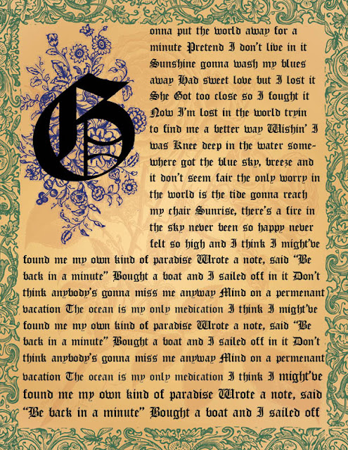
| Assignment 15: This is my illuminated manuscript. We used brushes in illustrator. I used 3 different ones- the 3rd is faded into the background (it's a rose). |
 |
| Assignment 16: This is my infographic history timeline. I like how it turned out, but it took me awhile to come up with an idea for it. We used illustrator and in design. |
 |
| Assignment 17: Logos- These are my logos for Three Tree Landscape. I used Illustrator. I like how they turned out. |
 |
| Assignment 18: Here are my logos for Mimi's flower shop. I like them. |
 |
| Assignment 19: This is my business card for Azul salon & spa. I like the color . |
 |
| Assignment 19: This is my letterhead. |
 |
| Assignment 19: This is my envelope |
 |
| Assignment 20: This is my poster for dog rescue. I like how it turned out. |
